Not long ago, someone reached out to us with a very simple question:
“Can I use your system with JAWS?”
JAWS, for those unfamiliar, is a screen reader used by people who are completely blind. That question caught me off guard—not because it was unreasonable, but because I didn’t have a clue. We’ve always tried to make our software usable and efficient, but this was the first time someone put that kind of accessibility directly in front of us.
Since then, we’ve been doing a lot of thinking—and a fair amount of unlearning and reworking too.
What we Didn’t See
One of the first things we realized is how much of the modern web is designed around visuals. We build with our eyes. We use icons, colors, drop-downs, modal windows—elements that feel intuitive when you can see them. But for someone using only a keyboard and a screen reader? It’s a completely different experience.
There’s this thing called a Tab Trap. It’s when a user tabs into a part of a site—like a calendar picker or a popup—and then gets stuck. Can’t tab forward, can’t tab back. No way to exit. That kind of thing is frustrating for anyone, but for someone using JAWS or another screen reader, it effectively breaks the page. We’re now actively working through our own systems to eliminate these, and it’s been eye-opening to see just how many there are.
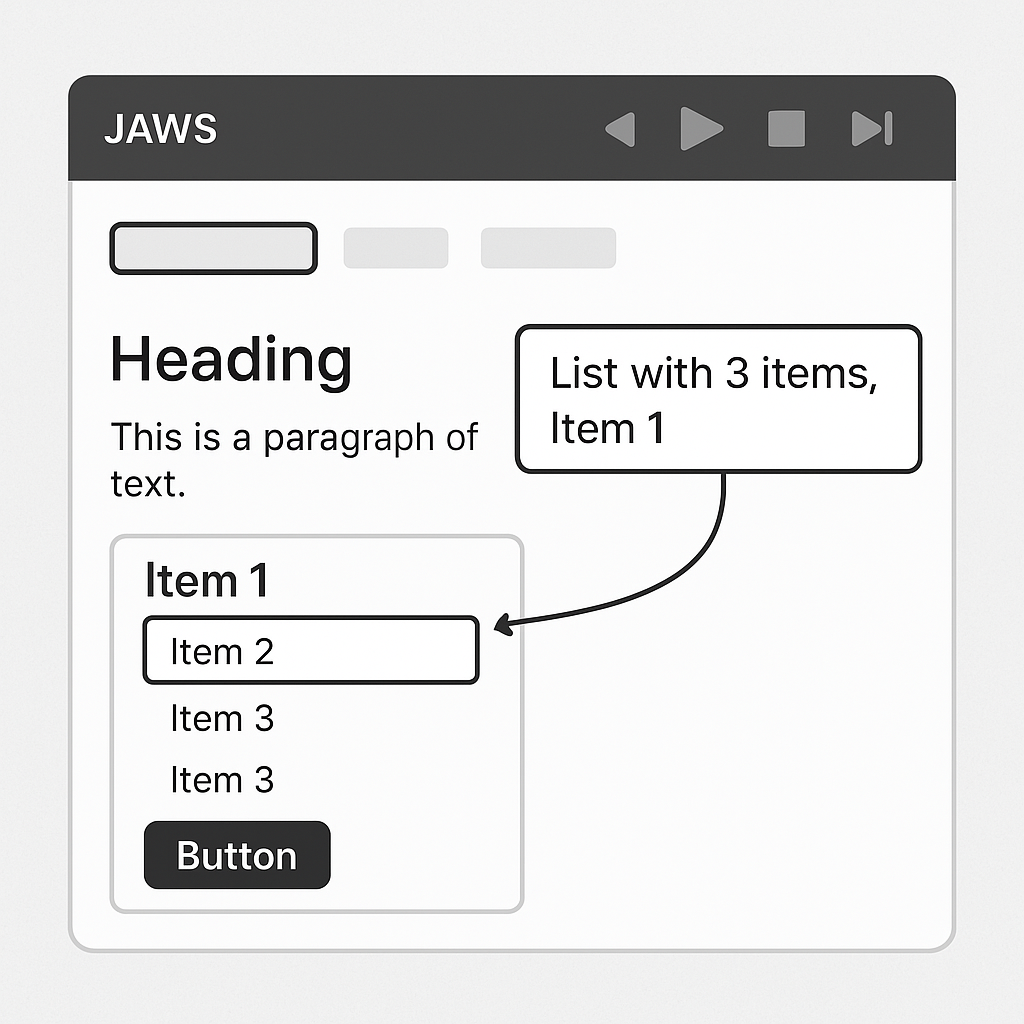
ARIA Tags (In Plain English)
As we’ve been learning, the fix isn’t just about moving things around. It’s about communication—between the code and the screen reader. That’s where ARIA tags come in.
ARIA is a way for us to “label” parts of the interface in a way that makes sense when spoken aloud. Think of it like adding audio signage to a visual interface. For example, if you have a button with a gear icon, a screen reader might not know what that does. But with ARIA, you can say, “This is the Settings button.” Simple, but essential.
It’s not just about labels, either. ARIA helps define relationships between elements: which text describes which field, what’s currently focused, what changes dynamically. All of this gives blind users the context they need to navigate confidently.
Learning from Our Own Products
This whole experience also made us look at our own Hosted PBX platform with a fresh perspective.
One of our long-standing features—click-to-dial—turns out to be more useful than we originally gave it credit for. What we call “click-to-dial” can actually function as a tab-to-dial for someone using keyboard navigation. A user can focus on a number, hit Enter, and initiate a call that rings their physical desk phone. That’s a surprisingly accessible workflow when you think about it.
We’ve also committed to making our desktop communicator—our softphone app—more accessible. That’s going to take some focused development work, since it wasn’t originally designed with screen readers in mind. But already, it offers advantages over a physical desk phone. For example, on a traditional hardware phone, you might be able to memorize the key sequence to initiate a 3-way call, but there’s no way to read your contact list or see who’s available. Our desktop communicator, on the other hand, can display contact names—and with some development, we can even expose their presence status (available, on a call, offline) in a way that a screen reader can understand. That’s something we’re actively exploring, and it’s opening up new possibilities for making these everyday communication tasks more inclusive.
One small win we stumbled into years ago: all of our PBX feature codes are listed inside the communicator in a dedicated tab. We did that for convenience, but now we realize just how helpful that is for users relying on keyboard or screen reader navigation. Most providers bury those codes in documentation. We surface them directly in the interface—and now, that decision has taken on a whole new level of relevance.
More Than a Feature
I’ll be honest—accessibility wasn’t something we had deeply prioritized before. There’s no sales funnel for it. No big marketing push. It’s not something that “closes deals.”
But after even a small window into how blind users experience our product, we aren’t going to ignore it. It’s changing how we think about everything, from our UI structure to how we organize information. This won’t be quick. Some of our tools are older and weren’t built with this in mind. But we’re learning.
A Shift in Perspective
Playing with JAWS for two days has been humbling. Not in the trendy “growth mindset” way but in a real, human way. There’s a whole world of users we haven’t fully considered until now—and that’s on us.
We don’t know yet how far we’ll be able to go, but we’re moving. We’re asking better questions. We will be designing differently. And we’re approaching our software with a new lens: not just what looks good, but what works—for everyone.